hierarchy + tschichold
The purpose for this project was to design a set of three book covers that contains the essence of Jan Tschichold's work - a influential 20th century typographer master. The goal was to not copy his visual "style" but rather reflect his values as well as explore and understand hierarchy using supplied text and determine the relationship with said text.
All text used in this project:
Jan Tschichold,
Master Typographer: His Life, Work and Legacy,
Cees W. de Jong, Alston W. Purvis, Martijn F. Le Coultre, Richard B. Doubleday, Hans Reichardt, Cees W. de Jong-editor,
Thames & Hudson,
London,
2008
Master Typographer: His Life, Work and Legacy,
Cees W. de Jong, Alston W. Purvis, Martijn F. Le Coultre, Richard B. Doubleday, Hans Reichardt, Cees W. de Jong-editor,
Thames & Hudson,
London,
2008
Typefaces used in this project:
• Adobe Garamond pro
• Bauer Bodoni
• Futura
• DIN
• Univers
• Serifa
• Memphis / Rockwell
The text that was supplied was to be used only once and there was a maximum use of two colors for each cover.
The three books are (show in this order):
• Title dominant
• Sub-title dominant
• Name dominant
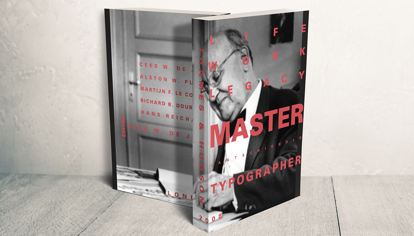
This is my first proposal. I wanted use all the space that the cover could offer as well as give a bold and diverse personality to the cover by using different kern spacing and size of text. One of the requirements for the title dominant cover was to use a portrait of Jan Tschichold, himself. I chose this image because it showed him in his practices which is very fitting for this project.

This is my second proposal. The idea for this cover was to give a calm and comfortable feeling with a bit of contrast. The way the words sit on the shelves gives a realistic characteristic to them because it's like they have a sense of gravity. The requirement for this cover was to use a metaphorical image that represents an attribute of Jan's work so I decided to choose an image of bookshelves because Jan would always use a grid in his works and they would look similar to shelves. The use of the Futura and Garamond font gives a very interesting contrast that makes both them stand out to the viewer.
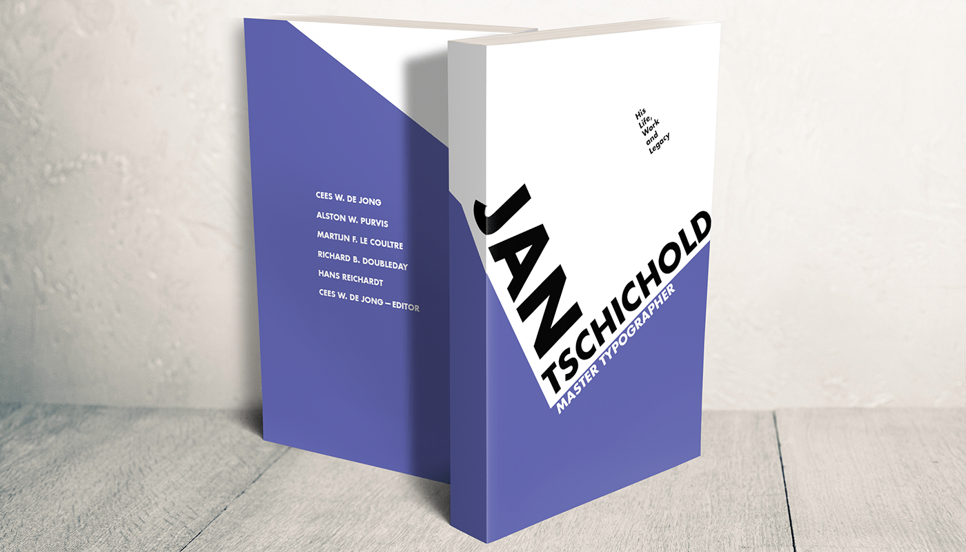
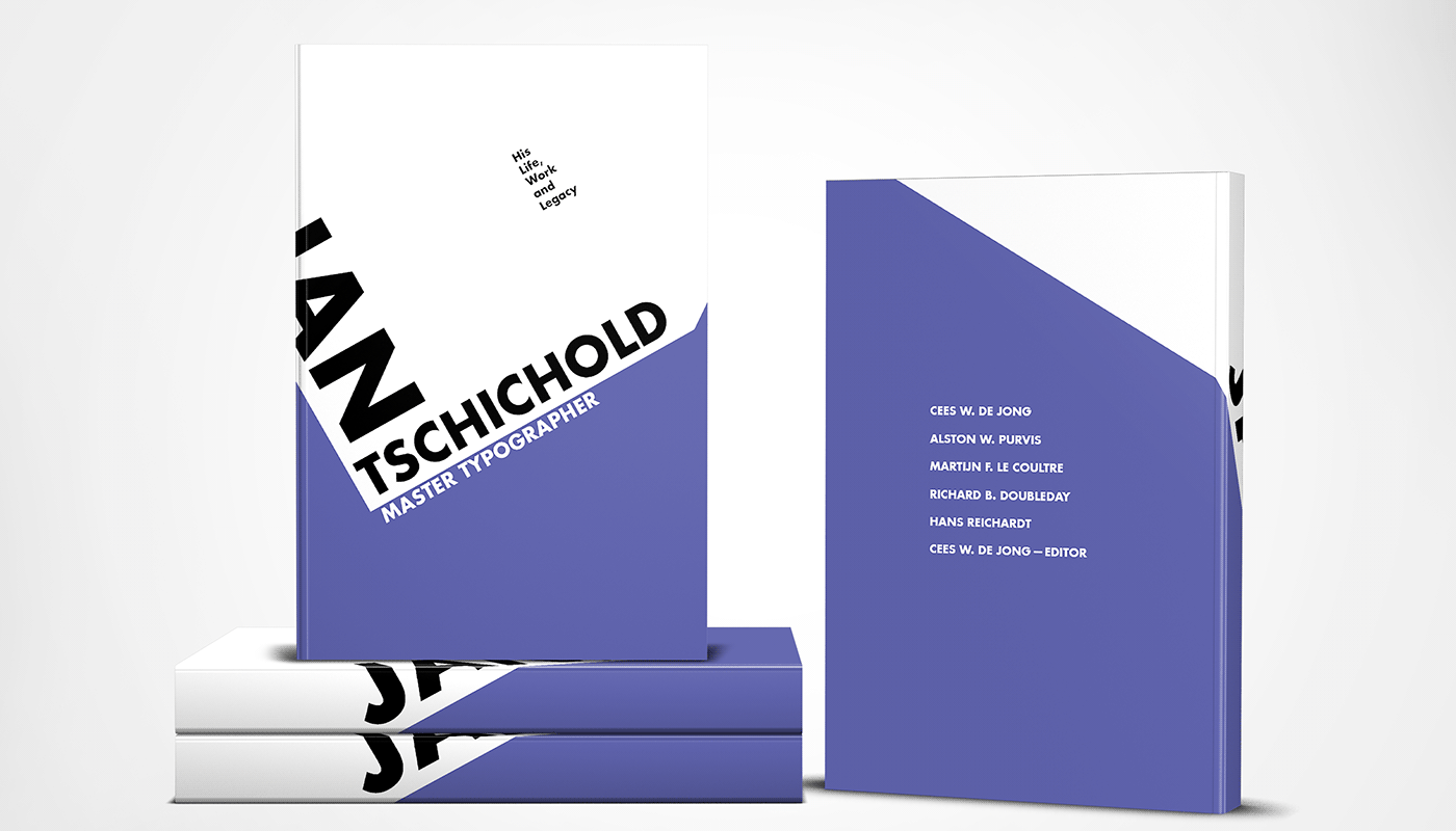
This is my third proposal. This one was my favorite of my three. I like the purity of Tschichold's work and I wanted use that characteristic for this cover since there was no requirements for an image. Although this cover was made with an utilitarian mindset, the end result is still very pleasing to the eye. The word "Jan" rolls off the front cover so when the viewer is looking at it from an angle there is more emphasis on typographer master's name.
Little Easter egg that may difficult to see from a first glance at my third proposal.
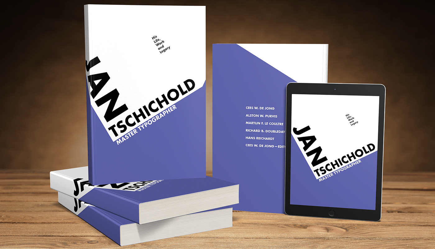
Paper version mockups that show form a variety of angels with a tablet view of the cover. The tablet cover gives a different view of the front cover because "Jan" doesn't bleed off from the front like in the paper and hard covers.
The contrast between the white and blue are loud but they don't overpower the words.

The hard cover always looks a little more interesting to me compared to the paper covers. I think it may be how the slight curve of the spine helps supports when "Jan" bleeds off the front.


The second image really shows the emphasis of the word "Jan" and give an interesting effect in the hierarchy.
